Design Principles and Elements
(this post contains affiliate links)
Back in the day,
When I was in college
Studying Interior Design
I had to learn a lot of design principles and elements.
But over the years, the design principle that I’ve used most consistently for myself and for clients is
B A L A N C E
For me, it’s really the best design rule there is
Because if you don’t follow it,
Your rooms are going to feel awkward
And, well, out of balance.
Basically, Balance just means that the visual weight in a room is evenly distributed around the room.
So if you have something visually heavy on one side of a room,
Pin for later
make sure you have something visually as heavy on the other side of the room to keep the room from feeling lopsided.
Pin for later
Get tips for creating a home office HERE
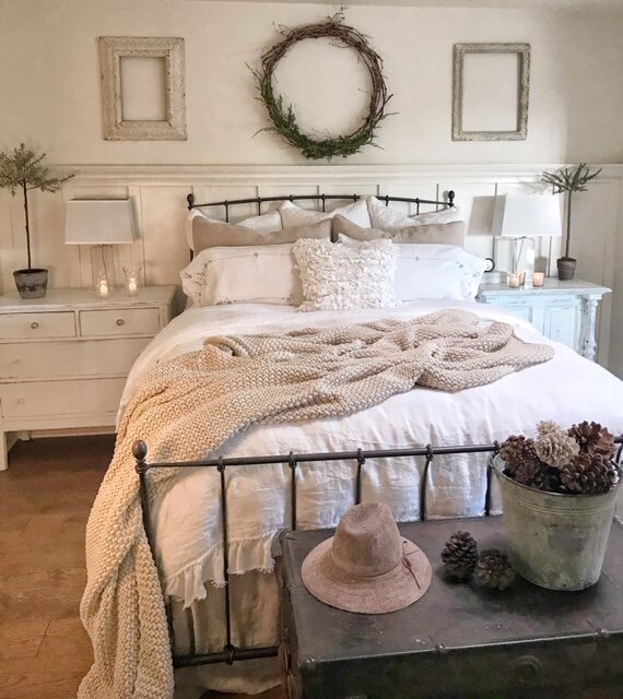
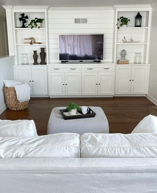
A great way to keep spaces in balance is to use symmetry
Which means that one side of a room or wall is visually the same as the other side.
Pin for later
If you don’t want your symmetrical room to look too formal,
Pin for later
vary your furniture and accessories so one side isn’t the exact mirror image of the other.
Pin for later
Read about this symmetrical media wall HERE
Another design ‘rule’ that I use all the time is:
Always try to decorate
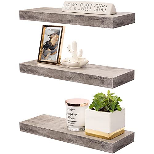
In groups of threes
Or some other odd number
Pin for later
This armoire is a great example of items grouped in threes (pots, plants, blankets) and the whole look is visually symmetrical, right down to the trees on each side.
There’s something in our brains that makes them more accepting of items grouped in odd numbers…
Pin for later
This is ‘The Magic Triangle’ of accessorizing
In this image there are two groups of three accessories: the three items on the table, and the two topiaries with the frame on the floor. Notice that your brain interprets the stack of books as one item (and notice that there are three books in the stack.) And I bet if we were to count them, there’d be an odd number of twigs in the urn!
I just looked again at this image of the bathroom from our last house and it cracked me up how many groups of three there are in this room! Can you spot them all?? (Candles, pillows, balloon shade, lights, drawers, faucets…). I really do design in groups of three!
Of all the consults I used to have with clients, the ones that were the most surprised were the ones where I taught them about balance and using odd numbers in decorating. They were always so amazed at what a difference it made in the feel of their room.
So, if your rooms are feeling a little ‘off’,
Don’t worry too much about the other design principles and elements
Just take a look around
And ask yourself
Am I out of B A L A N C E?
Or
Could I re-group some things into odd numbers?
Pin for later
As an Amazon Associate and rewardStyle Affiliate, I may earn a small commission on qualifying purchases at no additional cost to you


