

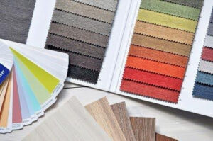
Tufting is an incredible art form that combines creativity and craftsmanship to produce textured, colorful pieces that are as unique as their creators. Color plays a crucial role in tufting design.
But how do you decide which colors to use? This is where color theory comes in, it is a framework that helps you understand how colors interact, evoke emotions, and bring your designs to life.
In this article, we’ll explore the fundamentals of color theory and how you can use them. Understanding color theory will elevate your designs and captivate your audience.
The Basics of Color Theory
Color theory is a set of principles used to create harmonious color combinations. It’s rooted in the color wheel, which organizes colors into three primary groups:
- Primary Colors: Red, yellow, and blue are the foundational colors. They cannot be created by mixing other colors.
- Secondary Colors: These are created by mixing two primary colors, resulting in green, orange, and purple.
- Tertiary Colors: These are formed by mixing a primary color with a neighboring secondary color, creating hues like red-orange or blue-green.
Understanding the relationships between these colors is key to creating balanced and visually appealing designs.
Tip: You don’t know how to start with tufting? Read this beginner´s guide.
How to Use Color Schemes in Tufting
Color schemes are combinations of colors based on their position on the color wheel. Each scheme evokes a specific feeling or mood. Here are some popular ones and how they can influence your tufting projects:
- Monochromatic Color Scheme
A monochromatic scheme uses variations of a single color, including its tints (lighter versions) and shades (darker versions).
- Why Use It?: This scheme creates a cohesive and calming effect, perfect for minimalist or modern tufting designs.
- Example in Tufting: A blue rug with varying shades of navy and sky blue creates depth while maintaining simplicity.
- Analogous Color Scheme
This scheme uses colors that are next to each other on the color wheel, like red, orange, and yellow.
- Why Use It?: Analogous colors create harmony and warmth, making them ideal for inviting or cozy designs.
- Example in Tufting: A wall hanging in warm tones of yellow, orange, and red evokes the feeling of a sunset.
- Complementary Color Scheme
Complementary colors are opposite each other on the color wheel, such as blue and orange or red and green.
- Why Use It?: These combinations create high contrast and energy, making your designs stand out.
- Example in Tufting: A bold rug featuring orange accents against a deep blue background can become the centerpiece of a room.
- Triadic Color Scheme
Triadic schemes use three colors that are evenly spaced on the color wheel, like red, yellow, and blue.
- Why Use It?: This scheme offers a vibrant and balanced palette, great for playful or eclectic designs.
- Example in Tufting: A whimsical rug with pops of red, yellow, and blue can bring a child’s room to life.
The Psychology of Color in Tufting
Color doesn’t just affect how your design looks: it influences how people feel. Each color carries emotional and psychological connotations:
- Warm Colors (red, orange, yellow): These evoke energy, warmth, and happiness. Perfect for tufting projects meant to brighten up a space.
- Cool Colors (blue, green, purple): These are calming and soothing, ideal for creating tranquil designs.
- Neutral Colors (black, white, gray, beige): These are versatile and grounding, often used to balance bold colors or create a sophisticated look.
When tufting, think about the purpose of the piece. Is it meant to energize a living room, create a cozy bedroom vibe, or add a professional touch to an office? Let the psychology of color guide your choices.
Tip: If you are not sure that you have the time for tufting, read the article about how long it takes.
Texture and Color: A Perfect Pair
Tufting isn’t just about color—it’s also about texture. Combining different yarn textures with your color choices adds another layer of visual interest. For instance:
- A monochromatic design in shades of beige becomes dynamic when you use a mix of smooth and fluffy yarns.
- Complementary colors like green and pink can be softened by using shaggy textures, making them less overwhelming.
Remember, texture affects how light interacts with your design, which can subtly alter the appearance of your colors.
Practical Tips for Applying Color Theory in Tufting
- Start with InspirationLook at nature, art, or even interior design trends to spark ideas. For example, a forest landscape might inspire a green and brown analogous palette for a rug.
- Test Before You CommitLay out your yarn choices together before you start tufting. This helps you see how the colors interact in real life, which can be different from how they look on a screen.
- Use a Color WheelKeep a physical or digital color wheel handy to experiment with different schemes and combinations.
- Balance Bold ColorsIf you’re using a striking color like red or neon yellow, balance it with neutrals or softer tones to avoid overwhelming the design.
- Play with ProportionsThe 60-30-10 rule is a helpful guideline: use 60% of a dominant color, 30% of a secondary color, and 10% of an accent color for a balanced composition.
Color theory is more than just a tool—it’s a creative ally in your tufting journey. By understanding how colors work together and how they influence emotions, you can craft designs that are not only visually stunning but also meaningful and impactful.
So, the next time you set up your tufting frame, take a moment to think about the story you want to tell through color. Whether you’re going for vibrant and bold or soft and serene, let color theory guide you in creating tufting pieces that truly stand out.
You’ve picked your yarn colors – what’s next?
Tufting isn’t just about colorful yarn. To get started, you’ll need a few key tools:
- Tufting gun – essential for the process
- Tufting frame – to stretch your fabric
- Primary fabric – usually cotton or polyester mesh
- Glue or latex – to fix the yarn in place
- Backing fabric – for finishing the back
- Scissors or clippers – for trimming
You might also want extras like grip mats or higher-quality trimmers.
Where to buy everything?
Most local stores won’t carry all of these supplies. Some art stores might have yarn, but not the right fabric or tufting guns. That’s why buying online is usually the easiest and most reliable option.
Recommended store
If you’re in Europe and looking for tufting supplies, Tufty.eu is a very good choice. They offer various tufting guns such as the AK-I and AK-II, several types of tufting fabric, dozens of yarn colors, and a wide range of accessories and spare parts. The website is easy to navigate, with clear product descriptions, real photos, and videos showing how everything works. They also deliver to most countries in the EU.
Takeaways
- Color theory helps you create balanced, harmonious, and emotionally impactful tufting designs.
- It teaches you how colors relate, how to use contrast, and how to shape the mood of your piece.
- Colors stop being random choices and become intentional tools.
Understanding color theory gives you full control over how your tufting looks and makes every new project stronger and more expressive.